Swirly Desserts
Swirly Desserts
Visual Identity, Packaging Design, and Creative Content
2025 - Present
Egypt
Concept & Direction
The ‘Flavor in Motion’ concept. We wanted to capture the joyful and playful spirit of the brand.
The direction focused on vibrant colors, fluid shapes, and appetizing visuals that make the audience ‘feel’ the texture.
By blending modern aesthetics with bold typography, we created a brand that looks as delicious as it tastes.
Project Overview
Swirly is all about indulgence and fun.
Propagamda was tasked with creating a brand experience that stands out in a crowded market.
From the dynamic logo to the eye-catching packaging, we ensured every touchpoint radiates positivity and flavor.
Our goal was to build a visual language that appeals to both the young and the young-at-heart, turning a simple treat into a memorable brand.
Visual Elements
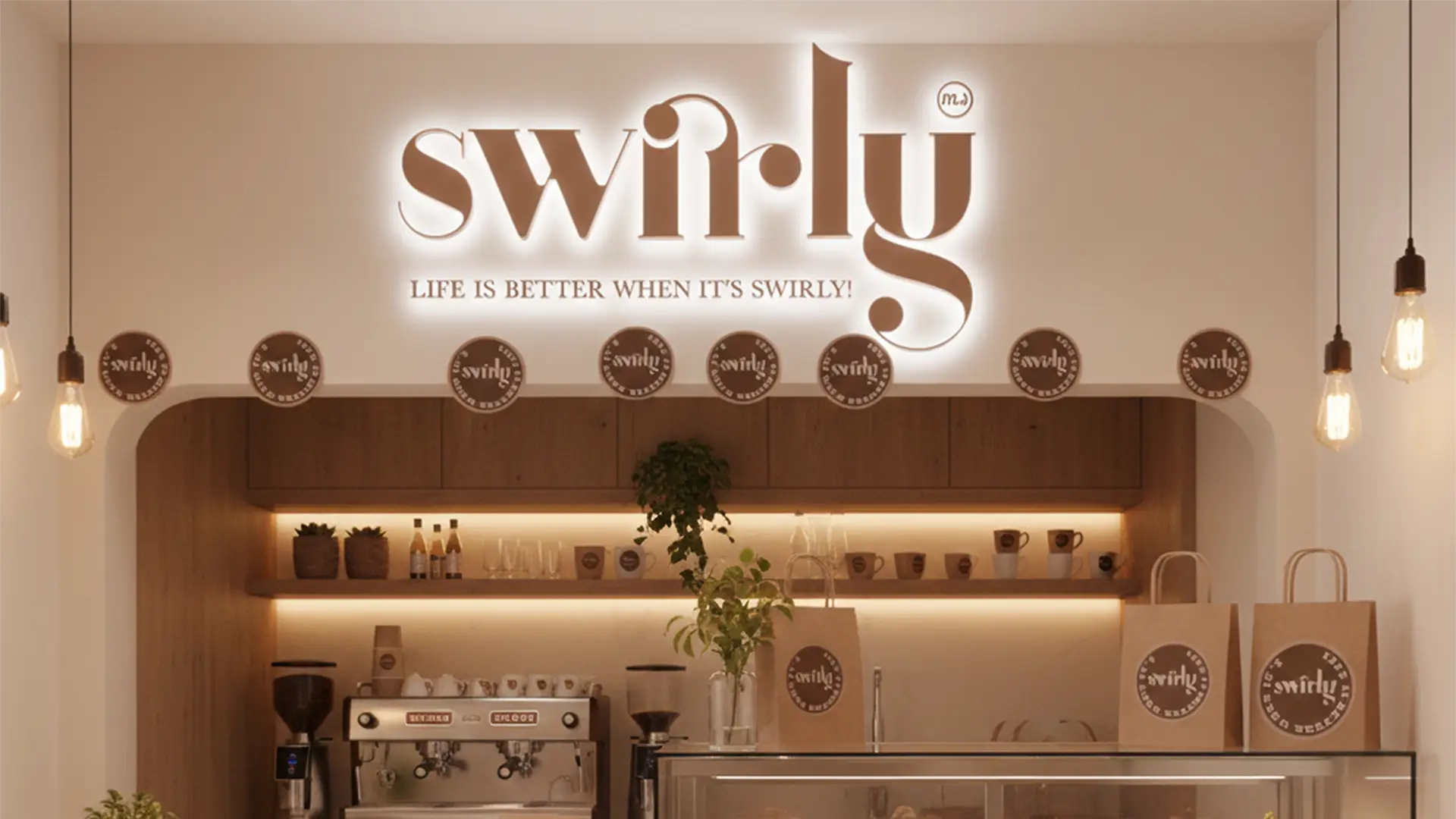
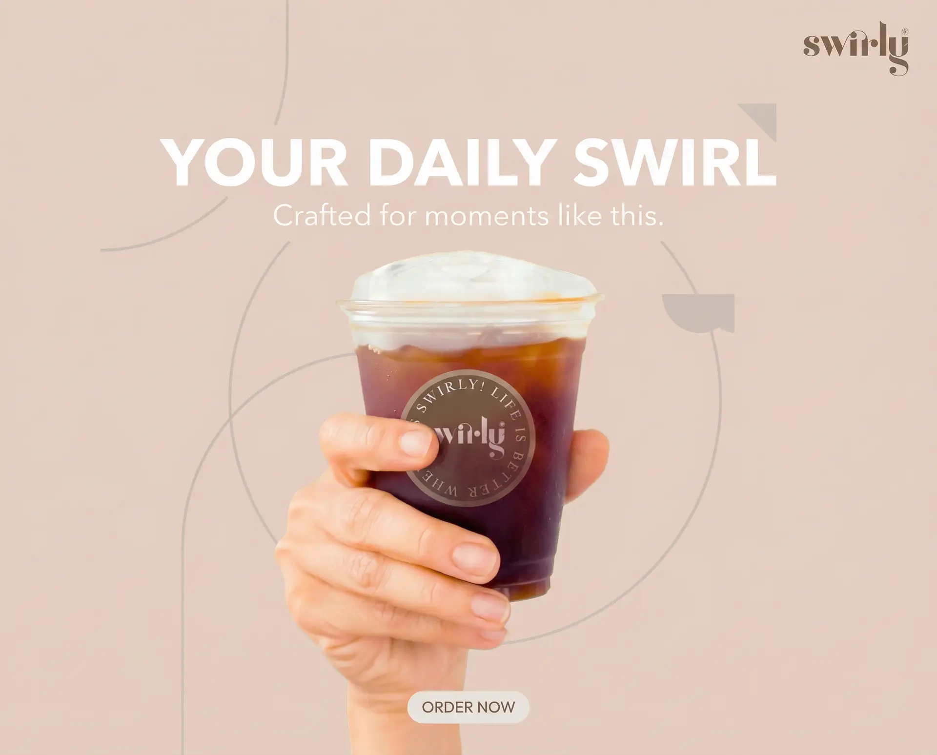
Designing a fluid and curvy logo that mimics the “swirl” of the product, using a warm and inviting color palette.
Creating packaging designs that are not only functional but also act as a piece of art, encouraging customers to share their experience on social media.
Producing high-speed cinematography and macro photography to highlight the details and freshness of the ingredients.
Developing a consistent Instagram grid with high-energy transitions and vibrant graphics to boost brand recognition.
Outcome
A refreshing brand presence. The new identity for Swirly resulted in a strong market entry, with the packaging becoming an instant hit on social platforms.
Through our creative execution, we helped the brand establish a unique personality that is now synonymous with quality, fun, and irresistible taste.